
Project Overview
Nintendo introduced the world to their hybrid console with the release of the Nintendo Switch in 2017. The success of this launch followed multiple periphery accessories, apps, and services which included Nintendo Switch Online (NSO), their online subscription service. While a crucial feature for online multiplayer gaming, the mobile application left many feeling underwhelmed.
I took on the gargantuan task of revamping the app by creating a more immersive and practical user experience for mobile players. My goal was to incorporate Nintendo's theme of "global community" by adding social media-esque features such as a forum, messaging capabilities, and photo sharing.
Research and Analysis
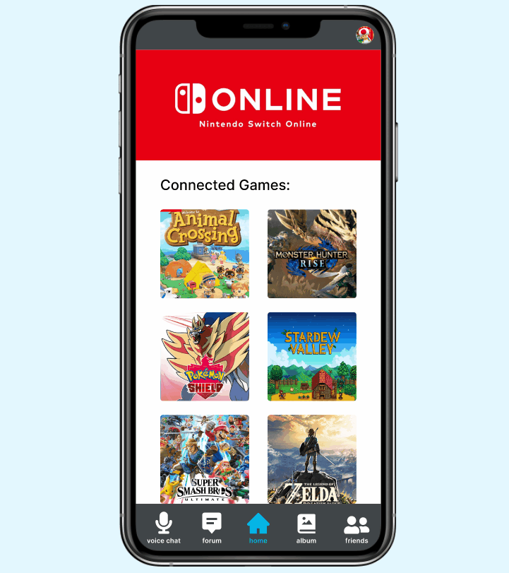
Nintendo is known for their very strong personal brand that includes intuitive, minimalistic UI design highlighted by punchy, contrasting colors. An analysis of competitors in the mobile companion app space revealed that companies normally carry this same branding into their mobile applications. The NSO app follows this same pattern. The features of the app are limited to a Voice Chat function and connectivity to three of Nintendo's game titles (pictured below).

Home screen of Nintendo Switch Online app

Voice Chat screen, the only feature of this app
Obviously, there are many voice chat mobile apps out there that can do what the NSO app offers but better. I formulated an idea of what the app needed to stand out and how its users may more directly interact with the userface.
When formulating the look and feel of the NSO app, I took branding into consideration along with data compiled from multiple user interviews. I identified user pain points from the original NSO app and documented their needs and goals for the new app. Using this information I developed the following persona.

By answering the question, "who am I designing for?", I was able to begin the process of redesigning this mobile app.
Information Architecture
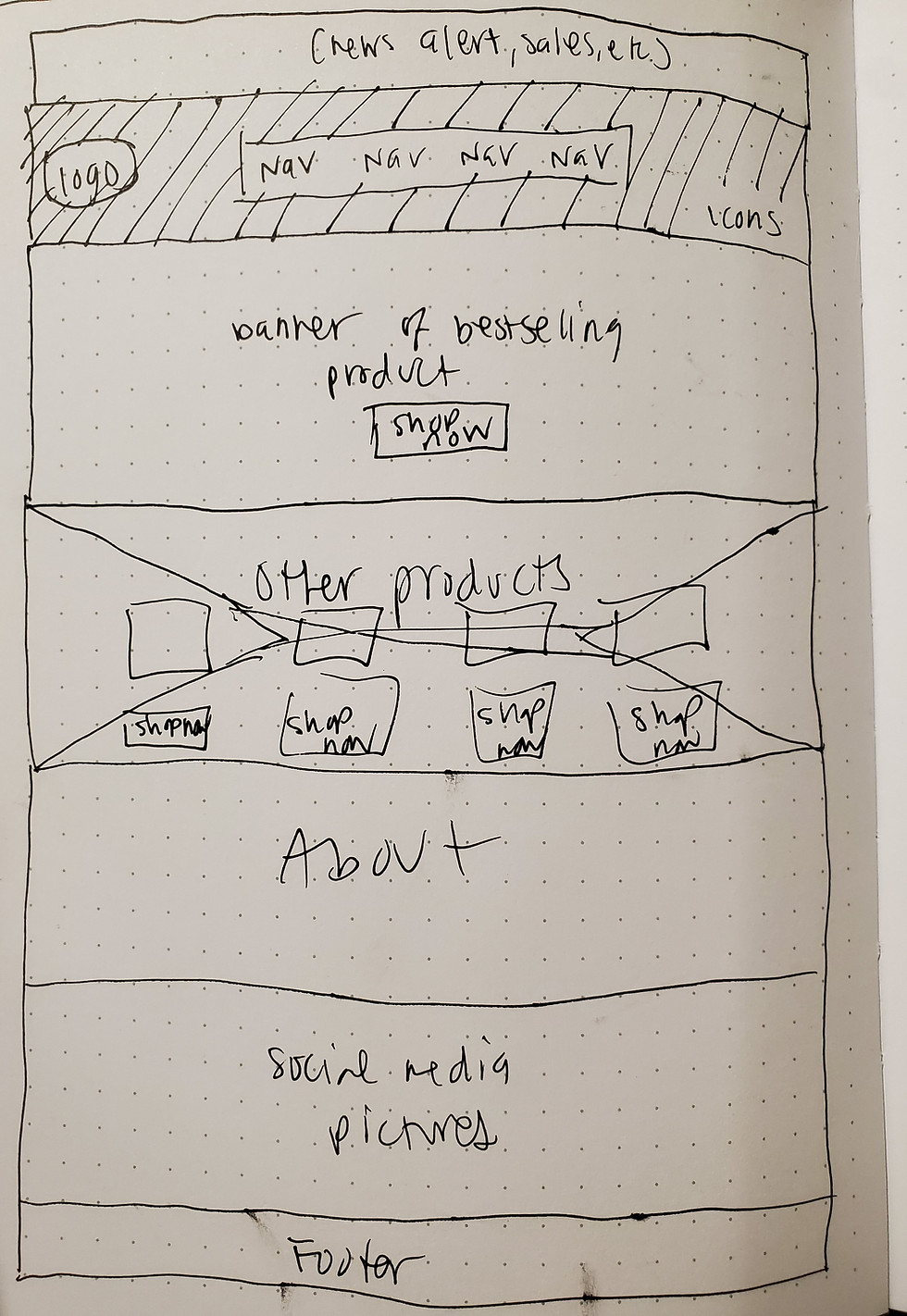
In order to visually organize the new features, I created a sitemap and task flow. These would be used to form the framework of future prototype screens.
Sitemap

Task flow

User flow

The addition of new social media-esque features required different flow charts to understand how users might navigate this new space. As the NSO app initially only had voice chatting, we needed a visual way to break down the steps of these new components and fit them into a user's daily usage routine. Considering how limited the usage of the app was to begin with, the features weren't very intrusive despite the major changes.
Ideation and Design
I began with sketches based on the current layout of the original NSO app. From my initial user interviews I discovered that this layout was disliked by the majority of the participants. With this information I formulated new layout sketches to build upon until I found a comfortable balance between new and familiar.
Preliminary Sketches
To help better visualize all the different layouts, I created low fidelity wireframes for each one. These are viewable here. Ultimately I went with the layout featured below and created multiple wireframe screens for the individual features.
Wireframes
User interviews in the earlier stages of producing this wireframe allowed me to tailor each screen into a more intuitive product. I then went on to develop the high fidelity prototype once the wireframe drafts were approved.


Synthesis and Implementation
A second round of usability testing was conducted on the final prototype to identify any potential pain points and to determine overall functionality. Each participant was tasked with completing three specific scenarios ranging from sharing a photo with a friend to uploading a file. All participants were able to complete these tasks with limited errors.


High fidelity prototype screens
Final prototype demonstration

User testing conducted over Discord, the most popular chatting platform for gamers to date
Testing revealed that users wanting to share photos with a friend may initiate the process from the Album screen instead of starting from the intended recipient's chat log. This was amended in the final submission. The following affinity map highlights the successes and updates needed after usability testing was completed.
Affinity Map

Conclusion
Taking an existing mobile application and adding new features requires incredible attention to brand identity. By understanding user pain points, goals, and needs, I was able to revamp the Nintendo Switch Online mobile app and create a more immersive experience for its users.
As next steps in improving user retention rates, Nintendo can introduce more community focused events and develop proprietary functions for mobile use. Users will be able to further solidify the sense of community they feel when using the mobile app and frequently return to it in order to stay up to date on their friends' latest activity.