Project Overview
Gamasutra (now known as Game Developer as of August 2021) was launched in 1997 as a hub for all things within the realm of video game development. It is unique in the gaming space for its heavy focus on business and programming news as well as being one of the first job listing websites to focus only on video game related jobs.
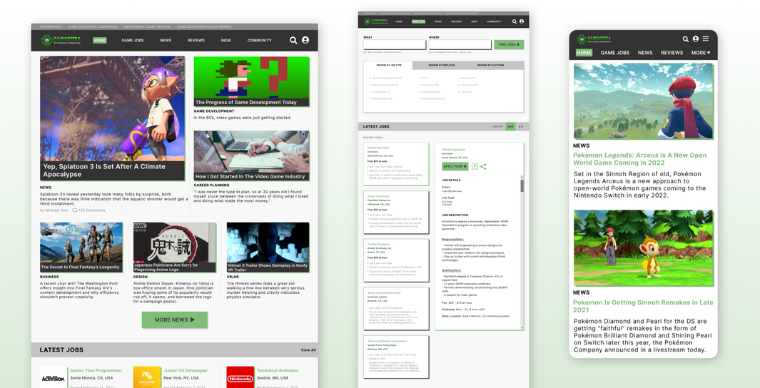
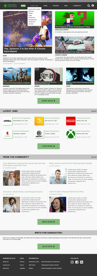
I was responsible for revamping Gamasutra's outdated user interface into a more modern and user friendly visual design while maintaining its nostalgic branding and color palette. My goal was to simplify the information architecture of the site while allowing for seamless transitions from browsing gaming news to career listings.
Research and Analysis
The key components that determine a successful news site include strong information architecture, comprehensive and coherent content organization, and an easy to use, visually appealing UI design. Gaming development news has always heavily relied on the virtual world, even more so now during the COVID-19 pandemic. In the case of Gamasutra’s competitors, all of them were web based.

The original Gamasutra landing page, practically untouched since launching in 1997.
In order to modernize Gamasutra, I needed to organize the wealth of information on the homepage and navigation bar first. I eliminated redundancy by conducting a hybrid card sort through Optimal Workshop. I then took the results of this exercise and conducted a closed card sort with the most reoccurring categories and cards. This data would form the framework upon which I built the sitemap and task flows off of.
I then conducted 1:1 user interviews to identify user needs and pain points summarized below.
.png)
.png)
With this information plus data gathered from competitive analysis, I was able to formulate the following User Persona.
.png)
When working with a news website of this size, conducting two levels of card sorting was necessary in order to see how users organized information and how I could better consolidate existing navigation. In minimizing the amount of content on the homepage, you can further achieve a more "modern minimalist" aesthetic that not only utilizes white space effectively but is also less eye strain on the user.
Information Architecture
After paring down redundant information, it was crucial to establish hierarchy among the remaining navigation topics. I used the following sitemap, task flow, and user flow to determine how content should be laid out.
Sitemap

Task flow

User flow

Ideation and Design
I sketched out different layout options before creating the initial wireframe in Figma. Usability testing on the high fidelity wireframes was a success so the same design was implemented into the final high fidelity prototype.
Preliminary Sketches

Wireframes
%20(1).png)
The secondary aspect of Gamasutra (which is quite frankly their most defining feature amongst the competition) is the job listing page. I wanted to create something that still felt part of Gamasutra as a whole but functioned as a separate entity of the main news site. I took inspiration from career listing sites like CareerBuilder and Indeed to develop the wireframe below.

Usability testing in the early wireframing stages allowed me to confirm the structure of the layout before proceeding further into a high fidelity prototype. I decided to create a responsive mobile design once all aspects of the high fidelity prototype were solidified.

Synthesis and Implementation
Revisions were made to the final prototype after a second round of usability testing with a different group of participants. Each participant was tasked with completing a specific task. I tested visual design, limited functionality of the navigation menus, and overall cohesion of information architecture. Revisions included a scroll to top button at the bottom of each news article, increased line spacing, and back navigation for mobile.
High fidelity prototype screens

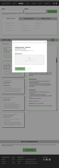
Second round of usability testing
Testing concluded at a completion rate of 100% and error rate of 0%. I was able to identify possible areas of confusion during the job application process and simplified the steps to minimize bounce rate. The following affinity map highlighted successes and issues during testing.
Affinity Map

Conclusion
Redesigning an outdated UI with excessive information overload proved to be an enormous task, especially in maintaining the client's existing brand identity. The wealth of information found on the homepage alone almost made identifying the problem overwhelming. However once I established the issue wasn't the amount of information but rather the redundancy in presenting the information, redesigning the navigation came easily. The process of information architecture was invaluable in simplifying and modernizing this new visual design.
As next steps, the client has the option of working with contract front-end developers to implement site wide changes.


