
Project Overview
Chatting on Riot Mobile is the heartbeat of the app. It's how players coordinate matches, stay connected between sessions, and build the social layer that keeps them coming back. Chat 2.0 wasn't just a visual refresh, it was a systemic overhaul of everything under the hood: the information architecture, the feature prioritization process, the bug management workflow, and the design-engineering handoff. It was also one of the first projects I owned end-to-end at Riot, which meant building the process at the same time I was executing it.
Note: Due to NDA restrictions, certain technical details and specifics of the development process are omitted from this case study.
🔍 The Problem
When Riot Mobile rebranded from League+, the existing chat system couldn't keep up with the weight of the change. Features were buried, core interactions took too many steps, and there was no process for deciding what to fix or in what order. "Chat 2.0" was the internal name we gave to the work of rebuilding that social foundation from the ground up.
🎯 Goals
-
Improve existing design of Social tab
-
Rework information hierarchy
-
Address chat related bugs in backlog
-
Simplify messaging and friend requests
🚧 Challenges
-
No existing framework for prioritizing high volume of small, distributed changes
-
Designing mid-rebrand required stakeholder alignment to avoid duplicate work
-
Had to make the case that Riot Mobile was worth investing in at all
Research and Analysis
Before jumping into solutions, I needed to understand the current state of the app from the inside out. I audited existing flows to identify friction points, conducted a competitive analysis of social features across messaging and gaming apps, and introduced the Stack Rank to bring order to a sprawling backlog of bugs and improvements.
Existing feature flow audit

Sending friend requests was one of the most friction-heavy interactions in the app at the time.
Competitive analysis

I examined patterns in contact search, friend requests, group chat, and messaging to identify industry best practices and gaps in our current experience.
Stack Rank
With no existing framework for managing a high volume of scattered changes, I adapted a prioritization method from a previous role to bring structure to the backlog. Each item, whether a bug, improvement, or new feature idea, was scored by priority, design effort, engineering estimate, and external dependencies. Every entry was linked directly to its Jira ticket and Figma file, giving the team a single source of truth for deciding what to tackle first.
Design Process
I started with sketches to map out the core flows before going further in my explorations, then gathered feedback from engineering, PMs, stakeholders, and other designers before moving onto wireframes. From there, the designs went through 2-3 rounds of iteration.
One notable discussion centered on the floating action button for adding a friend. The question was whether users would understand what it did or even notice it. To validate the pattern, I ran some "guerrilla style testing" with Rioters across different departments, sending them a screenshot of the wireframe and asking without context: "how would you start a new message in this tab?" The results gave us enough confidence to keep the FAB, leaning on a mental model players already had from apps like Gmail and Twitter.
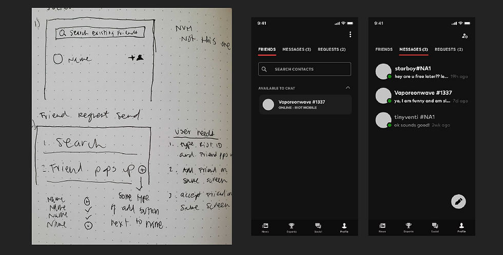
(Left) A page taken from my sketch notebook. (Right) Some early wireframes for the updated Social tab, created before we had established the purple low-fidelity wireframe format used across Riot.
Information Architecture
In the original design, friend requests were buried behind a 3-dot overflow menu which took two taps just to get there and no dedicated space for managing them. The player had to open the League Client to see a full list of friend requests and make adjustments there.
The solution I decided on pulled the requests out of the menu entirely and gave them their own tab, following the existing IA while still giving incoming and outgoing requests their own visibility. The FAB in the lower right kept adding a friend in context so the entire request flow lived in one place for the first time.
Before

(Left) Writing a new message lived in the upper right behind a chat bubble with a plus icon.
(Right) Friend Requests were accessed through the 3-dot overflow menu.
After
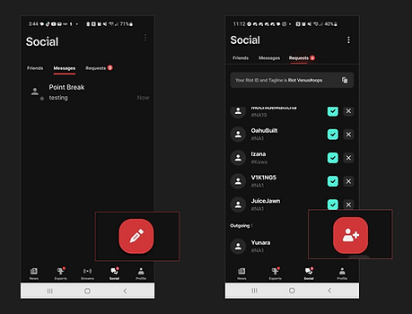
(Left) Writing new messages moved into FAB in lower right.
(Right) Requests moved to separate tab and FAB pattern reused.
Challenges and Iterations
Managing design for the long term
The core tension throughout was balancing usability goals against engineering effort and existing frameworks. Engineering initially pushed back on building the three-tab structure (Friends, Messages, Requests) but I made the case that the upfront investment now would pay off. Once the pattern was established, players would already be familiar with subtabs in the Social tab, making future implementations elsewhere in the app that much smoother. It scaled exactly as expected, and the tabs shipped. They are still an existing navigation pattern on Riot Mobile today.
Stack Rank prioritization
Another challenge was determining what to tackle first. With a long backlog of bugs and improvements, we had to make deliberate calls about which changes would deliver the most quality-of-life impact for the least engineering effort. I worked through the Stack Rank collaboratively with PMs and engineering, making prioritization decisions together rather than unilaterally.
Hesitation from game team
One of the less obvious challenges was organizational. The League game team was initially resistant to a mobile messaging system. Their concern was that if players could manage their social experience in the app, they'd have less reason to open the game client. It was a valid business concern and one worth taking seriously.
To address it, I worked with the product team to set up a direct convo with the League team and make our case. Our core argument was that Riot Mobile couldn't replace the game client; you can't play League from the app. The only entry point to the game is the client itself. What we were removing was a low-value reason to open it, not the reason why it mattered. Players staying socially connected between sessions would make them more likely to want to play, not less. Luckily this conversation landed and the feature moved forward.
Results and Reflections
This was my first project leading design end-to-end and it was a trial by fire in the best way. I was establishing a process while executing, advocating for decisions in real time, and learning what it meant to truly own something from problem to ship. Coming out the other side gave me the confidence to lead design on future projects.
The Stack Rank outlived my time at Riot. The team continued using it after I left, which might the thing I'm most proud of; not just that it worked, but that it stuck.
Below is a walkthrough of the updated Social tab as of February 2026.

Conclusion
This project taught me that good design isn't just about the screens, it's about building the systems, processes, and trust that make great work possible in the first place. From the Stack Rank to the tab restructure, every decision was made collaboratively, deliberately, and with the player in mind. It was my first time leading design end-to-end and it set the tone for how I approach every project since.